PTC Velocity Redesign
PTC Velocity is a Sales Enablement Platform, powered by SAVO Group. The goal of this project was to revamp the web UI and navigation that result in better user experience. My role on this project consisted of user research, prototyping , UI Design, and UI Development.
Challenge
Though its purpose is to enable better sales process, PTC Velocity’s bad UI and poor content organization were not tailored to fit the needs of our daily users, the sales reps and partners reps.
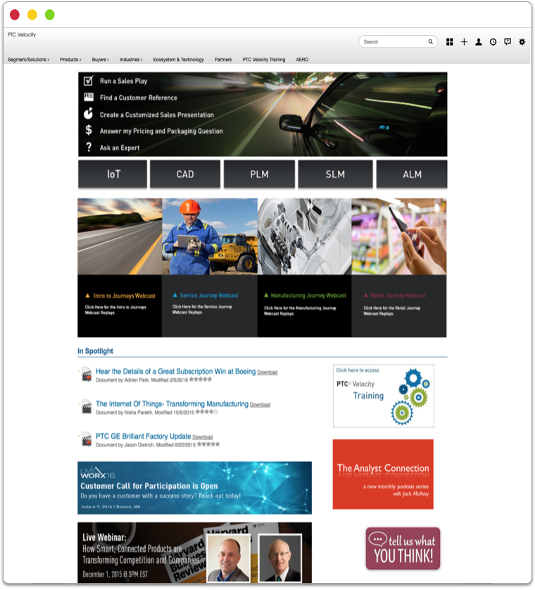
We knew the website refresh needed to start from home. The old homepage did not serve much of its purpose. Randomly placed announcement banners and unclear buttons on top made the homepage to look confusing.
Goals
The goals for this project consisted of:
Redesign with consistent UI
Better content organization
Provide easier way to access translated contents
Improve navigation experience
Explore
To learn more about our users’ experience with the current site, we conducted user interviews and usability testing. Based on the feedbacks we collected, we were able to identify 3 major user behavior using this platform"
Navigators know what type of content to look for. So they start navigating through pages to find them, often getting frustrated for getting lost in the navigation.
Searchers know what they are looking for, use the search bar to look for the contents.
Receivers are not comfortable using the system for its confusing UI. They want contents to be delivered directly to them.
User Stories
“When I go into Velocity, I care more about information design than pretty looking UI. As long as I can find contents as quickly as possible, the better.”
Many users struggled navigating through pages to find the right content. We needed to find the best way to make their discovery experience easy and seamless.

Design
The design process consisted of card sorting, information architecture, task flows, and creating low-fi/high-fi wireframes.


Features
Based on what we learned from multiple sessions of testing, I created the new layout of the homepage and the segment page by breaking each elements into modules, prioritise them and lay them out in order of importance.
This modular approach was implemented to make sure it addressed and solved the problems. I built out the working prototype, using HTML & CSS.
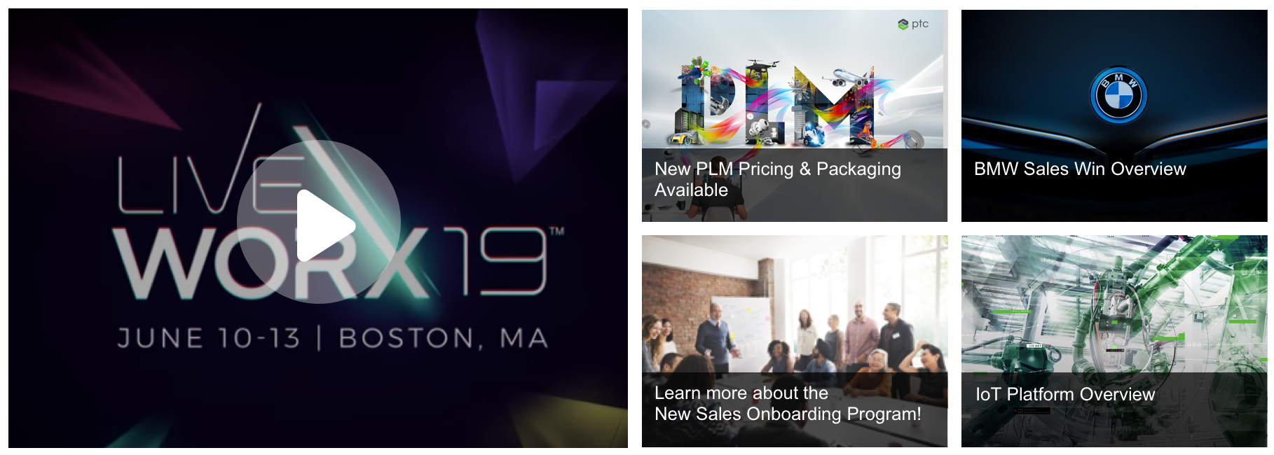
Feature 1: CTA Blocks
We had important announcements and messages we’d like to share with our users on weekly basis. Original design was a sliding banner. However, based on the feedbacks we received from testing, our users were not clicking the navigation buttons to toggle through different announcements. Thus I decided to create CTA blocks that housed multiple announcements at one glance.
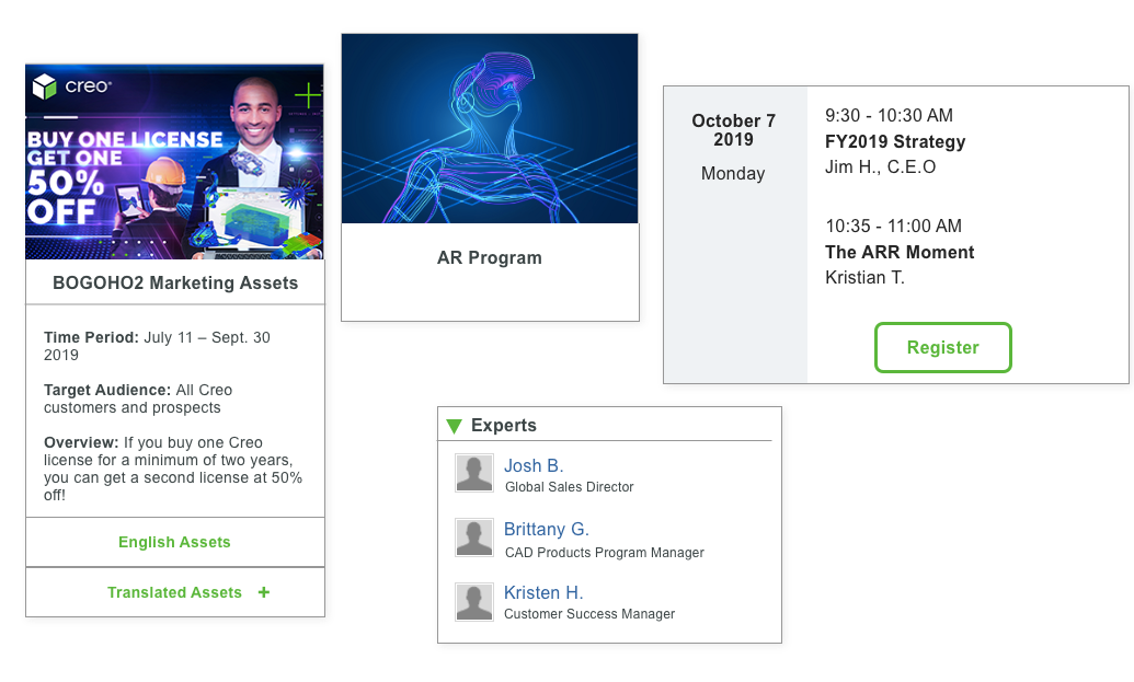
Feature 2: What's New, What's Hot
Time was valuable for sales reps. Even though the search and improved navigation from homepage intended to save their time, they still wanted to directly access recently uploaded and popular contents. So I implemented the "what's new and what's hot" widget that automatically updated.

Feature 3: Announcement Ticker
Besides the items that were featured in the CTA blocks, which were limited with 5 items, the secondary announcements needed the users' attention. An announcement ticker was intended to serve that purpose without taking over too much estate on the page.

Feature 4: Cards Patterns
To allow users to digest information and complete actions quicker in a content heavy website, I designed and developed cards patterns that could be used used across the platform. As a visual container that holds multiple information in organized way, cards were implemented to be used differently based on the nature of the content.
Putting Everything Together
From homepage to other subpages, here is how our website revamped.
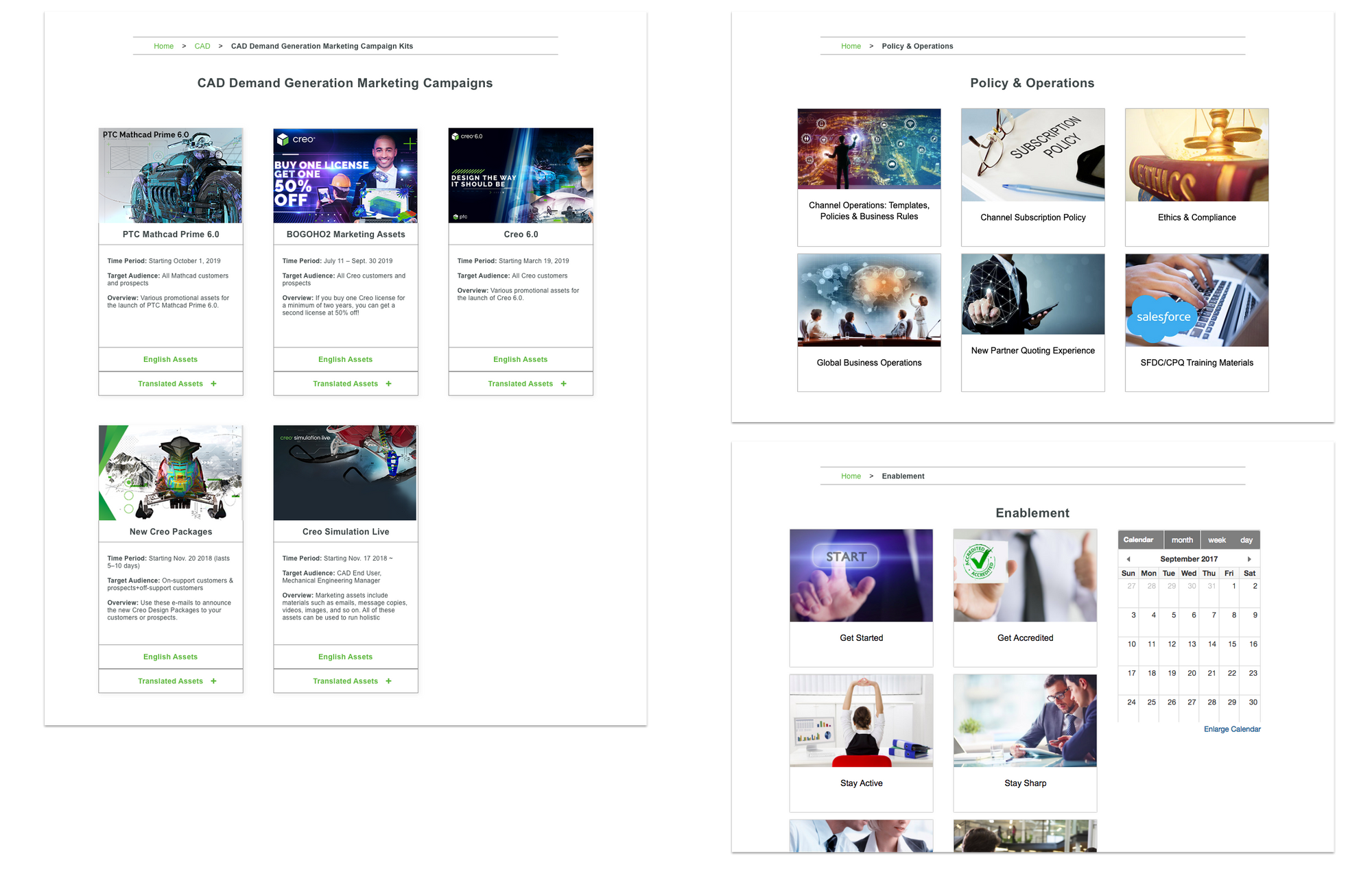
Homepage

Segment Page
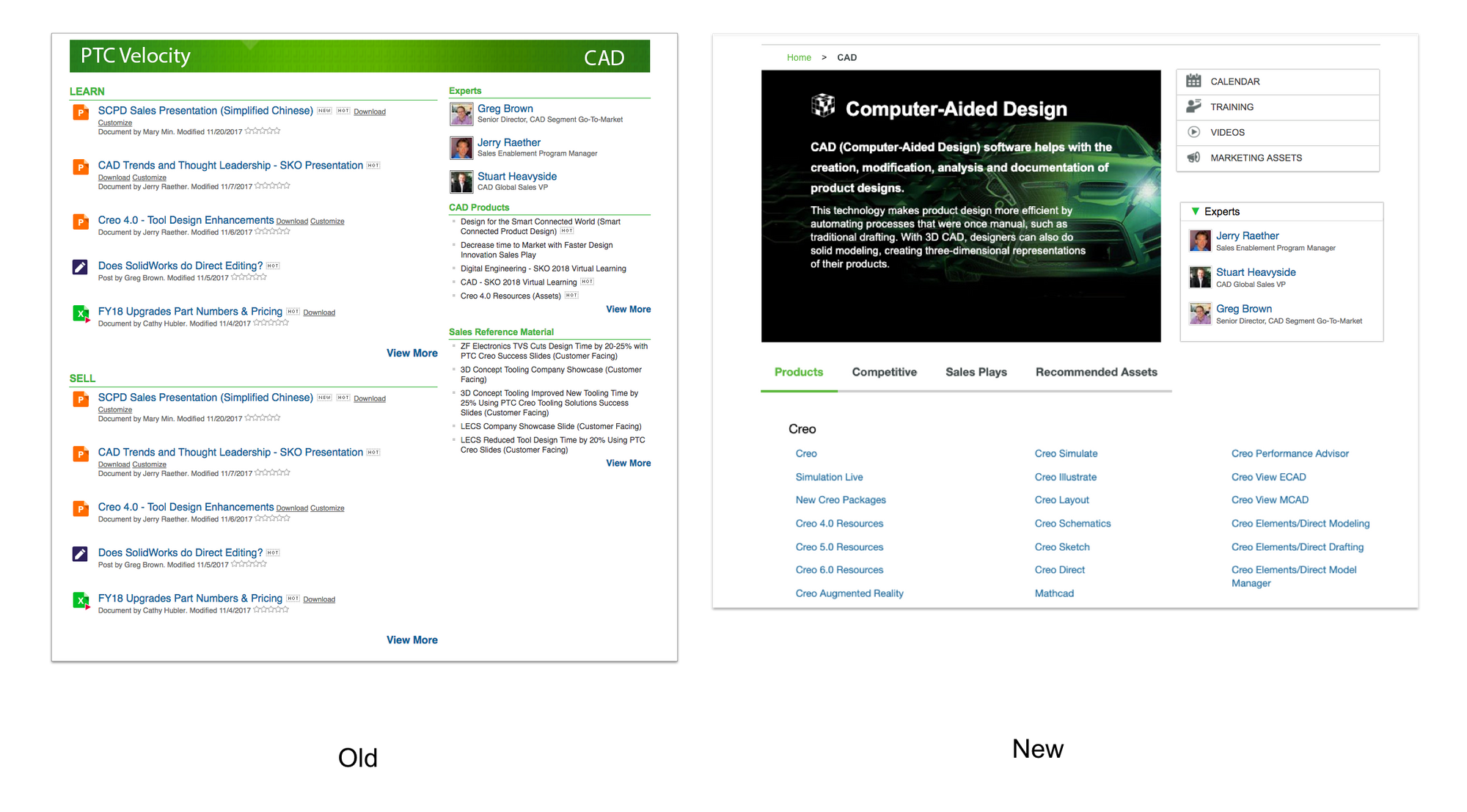
Product Page
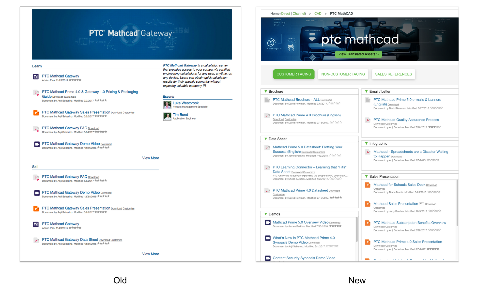
Card Patterns Use Case
Final User Feedback and Key Takeaways
There is never a perfect design! We had a lot of positive feedbacks from our users with the redesign. Users were satisfied with cleaner UI and improved navigational experience. However, with continued use new pain points and potential for improvement arose. This project demonstrated the iterative nature of UI/UX design, and why it is important to solicit continuous feedback from the user to improve your work.