
Mindful
A mobile app for a balanced approach to organizing life while making time for self-care.
Overview
Everyone takes part in tracking their day-to-day work, events, and more to remember what the next thing coming up is. Whether that is keeping track of items in a paper planner, digital planner, or even sticky notes there is always something we need to keep in mind.
Some people find planning ahead for things therapeutic but sometimes being on top of too much can become overwhelming. With how fast-paced the world is it is essential to find balance and be mindful of one's own peace.
The Problem
There are various planning methods and managing your tasks, so much so that the options alone can overwhelm people. People have expressed adding tasks into different books and digital apps that they also tend to lose track of what is where, while others who are more new to the concept of planning have no idea where to start. Neurological studies have shown those that who overload a schedule or take on multiple routines can quickly experience being overwhelmed and burnt out.
The Solution
The Mindful app helps users plan their time while maintaining a healthy life balance and mindset. Customizable templates, soothing colors, and easy-to-create tasks and time blocks will inspire users to consider themselves more when planning while encouraging productivity at any level. Guiding the users to prioritize better and manage only the main tasks that way there is no overload and less burnout. The application intends to implement quotes and reminders to take it easy and celebrate all wins will inspire them to be productive while being mindful of their time and self-care.
Role:
Sole UX/UI Designer and Researcher
Timeline:
13 Weeks
Tools:
Figma
Invision
Miro
Process:
Research
Ideate
Design
Test
Reflect
Research
Secondary Research
I wanted to open up my search to meet with individuals on the topic of organization. My criteria for who I wanted to meet with were those that have experience with planning to people who don't plan or track at all but have an interest in getting started.
Casting a wide net on my social media accounts with my screener survey allowed me to get perspective and gain a better understanding of how people approach organizing, where they plan, and their thoughts and feelings on the subject overall.
Primary Research
Through my research, I learned that there are various problems people face when it comes to organization. They struggle to find the right way to stay organized with day-to-day tasks, whether in a paper planner or digital.
Over-organizing and multitasking can actually lead to disorganization and cause the brain to overwork rapidly leading to a lack of focus and even anxiety.
Survey
I shared my survey on social media to gather different responses. My main objective was to speak to people with varying planning habits who are familiar with planning in any form. Based on the survey there was, of course, a variety of responses however I found that the majority liked to plan ahead but wanted the ability to customize their planner to their needs, and it was visually appealing to them.
Simplicity was also a common choice from this survey.
Key Takeaways
People love the idea of being organized but don't know where to start
Simple methods of planning are ideal to a variety of people than in-depth planning
Consistent planning leads to feeling overwhelmed
Visual appearance within planners is important to maintain the habit
Interviews
I interviewed 5 participants, remotely via Zoom. Each interview was recorded and I used Otter.Ai to record the text version of the interview. Each interview brought up various goals, pain points, and what the interviewee is currently utilizing when it comes to organization. There are quite a few similarities as well and overall a good amount of takeaways when it comes to planners, structure, and time management.
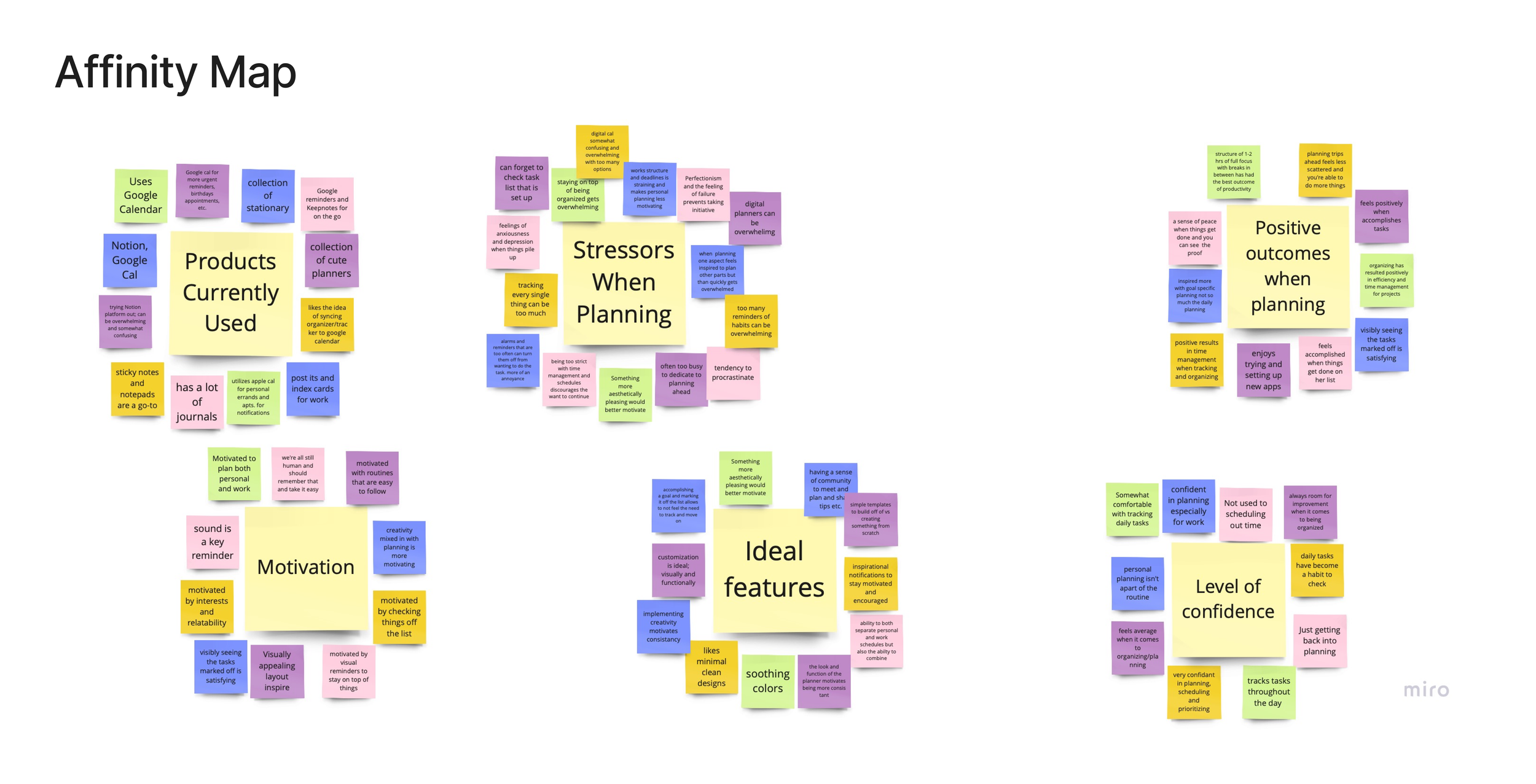
Affinity and Empathy Mapping
Breaking down each interview to create a broader picture and combining those that fit into themes like stressors when it comes to organization to positive results when maintaining even a small amount of daily or weekly structure.
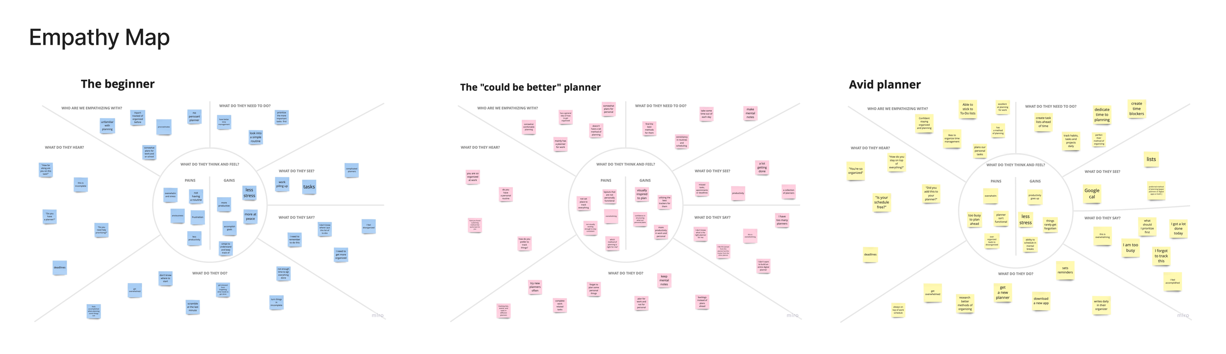

Personas:
I was able to build three personas by grouping the interview notes;
An avid planner who is generally comfortable with planners and has a method they have been using.
A beginner; is someone who has never or rarely structured out tasks, personal reminders, or focus times.
And lastly an average planner; is someone that is comfortable planning but hasn’t found the best method for them and is open to more structure in some aspects of their life.
Ideate
How Might We
I started ideating with broad How Might We’s (HMW) questions that tie into the pain points and goals of my personas. Writing these out helped gauge what a user might want to or be used to coming across on a planning platform.
HMW Questions
How might we alleviate the stress users have when getting organized?
How might we make users confident in finding information on organization methods?
How might we design a product that makes the user feel confident and inspired to stay on track with their tasks and plans?
How might we support our users' mental well-being and productivity throughout the day?
How might we consider when designing a product to work for the user rather than the user working for the product?
How might we consider when designing a product that will give the user a sense of personalization to their unique way of retaining information, planning, and visual appeal?
How might we positively encourage users to easily meet deadlines and make events?
Brainstorm Ideation
I drew 8 ideas per each HMW question (3 HMW questions in total). Drawing down a visual representation of what the user might see based on the personas and what might be more useful for each individual. I found with my research there is a desire for simplicity and customization when wanting to take on getting organized.
User Stories
I learned to put myself in the user's shoes and frame the research, personas, and HMWs to achieve a particular goal when it comes to planning. Prioritizing what the majority of the people I interviewed wanted out of a planning application.
Main User Stories:
As a user, I want to be able to customize a planner so that I can have the perfect planner catered to my uniqueness.
As "could be better” planner Kevin, I want a planner that will remind me of what I mark as important so that I can focus on these tasks first.
As a beginner Sofia, I want to feel confident when organizing so I can be more productive with my time.
Sitemap
I broke down each user story into different categories that eventually became potential landing pages and how best to organize them for smooth usability. I made sure a lot of the feedback from my interviews was reflected in my sitemap.

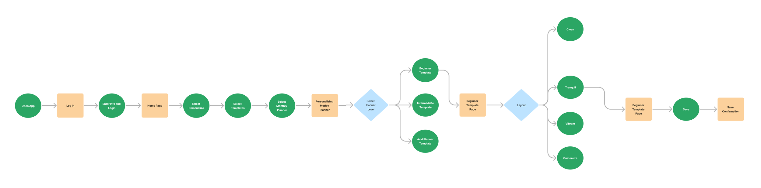
User Flows
I selected 3 flows that spotlight features I thought would be good to see the steps for. These flows represent the feedback I received from my interviews and the ideal features a user would want to see from an organizing application.
Create a task
Personalize/customize functionality and design
View your progress within a week

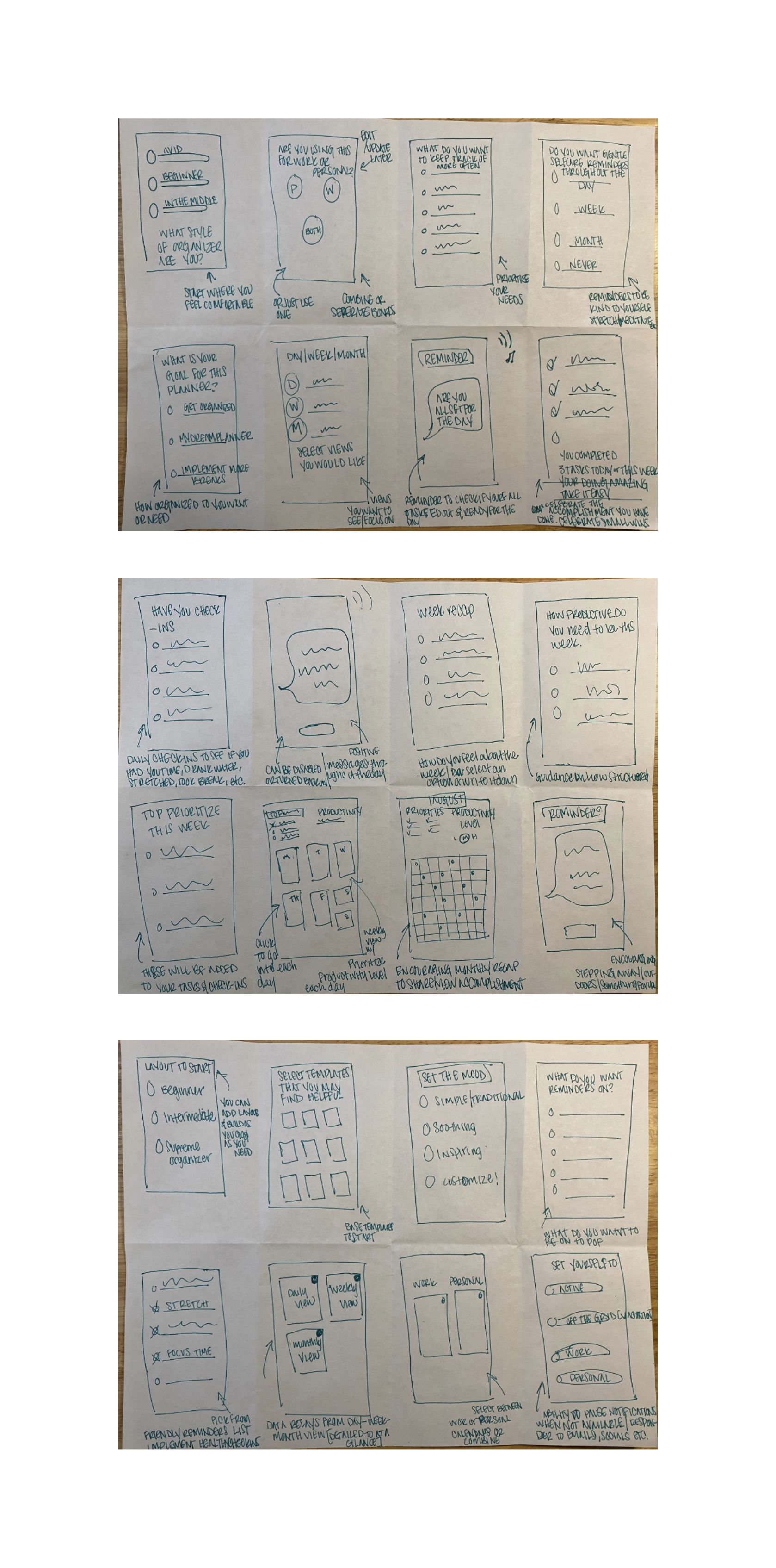
Sketches
I found it very helpful to get back to pencil and paper and just have fun with the basic outline. My sketches were a visual representation of what my application could look like. I wanted to stick with the overall theme of simplicity and customization.
Design
Wireframes
I worked on 4 variations of my mid-fi wireframes to ensure a “happy path” for future users. Moving into wireframes after the sketches helped me get a better idea of the structure of the app overall. The goal was to make a minimal, informative, and overall pleasing outline for my application.
Incorporating frames and auto-layout into my design for the first time was a game-changer for me. It gave me a better understanding of the direction I wanted to take and the flexibility to make adjustments easily. I feel like this experience has enhanced my design skills moving forward.
Key Takeaways
Considering how would certain components like a task tracker actually look within an app
Making sure the key features of the app are highlighted at the very top
Keeping in mind the buttons that a planning app would have readily available


Moodboard
I wanted to pair simple illustrations and easy-to-use components so the user is not overwhelmed with too many visuals and complicated functionality. My mood board represents the calming aesthetic the brand mindful stands for.
Style Guide
I wanted to stick with a calming color palette and opted for more muted tones of green, and cream, with blue and orange accent colors. I wanted the font to also be minimal and clean which made Montserrat a perfect choice for my overall design.
Hi Fidelity Screens
To build out my hi-fidelity screens, I pulled in my medium-fidelity and started incorporating the style guide and overall feel from the mood board. This process along with the medium fidelity screen took the most time and went through 3 variations. However, the look and functionality kept evolving and became an overall realistic application that I am really happy with. Key things I adapted based on really helpful feedback and guidance were spacing, and visual accessibility of the buttons and components especially when it comes to drop shadows on lighter components.


Test
Prototype
Building the prototype and watching the application come to life was a very fun and exciting process. I initially used the Invision platform to build an easy walkthrough of the app.
I made sure to keep the animations consistent when moving throughout the page and offered users the ability to exit modals from anywhere outside of their frames.
Usability Testing
I was finally ready to show my prototype to users and conduct user testing. This portion was one of the most insightful parts of the overall project. I hosted 5 separate recorded Zoom sessions and had each user walk through the three tasks I set for them. I thankfully had users of all planning levels similar to my personas. I was able to receive feedback on ease, functionality, appearance, and general recommendations on what would make the experience better.
Objectives:
The objective of the usability testing is to get real user feedback, suggestions, and any flaws they may come across while using the application to better understand opportunities for improvement.
Test Questions:
What do you do for work or for the majority of your day?
What do you do for fun or as a hobby?
What kind of method for planning or tracking tasks do you currently use?
Do you prefer in-depth planning or quick to-do's? Why?
Do you find reminders helpful?
What do you think about progress reviews? Why?
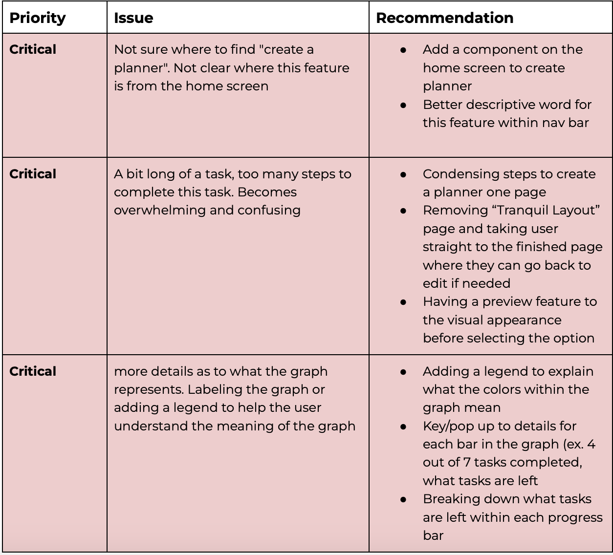


Issue 1:
Not knowing where to go to customize or view a planner. Users did not know where this feature would be on the Home page or the Navigation bar.
Issue 2:
The number of steps when customizing the planner felt like too many steps. Some users found some of the initial template creation pages confusing.
Issue 3:
A better understanding of the graphs and overall progress page. Users didn't know what the progress bars and colors referred to.
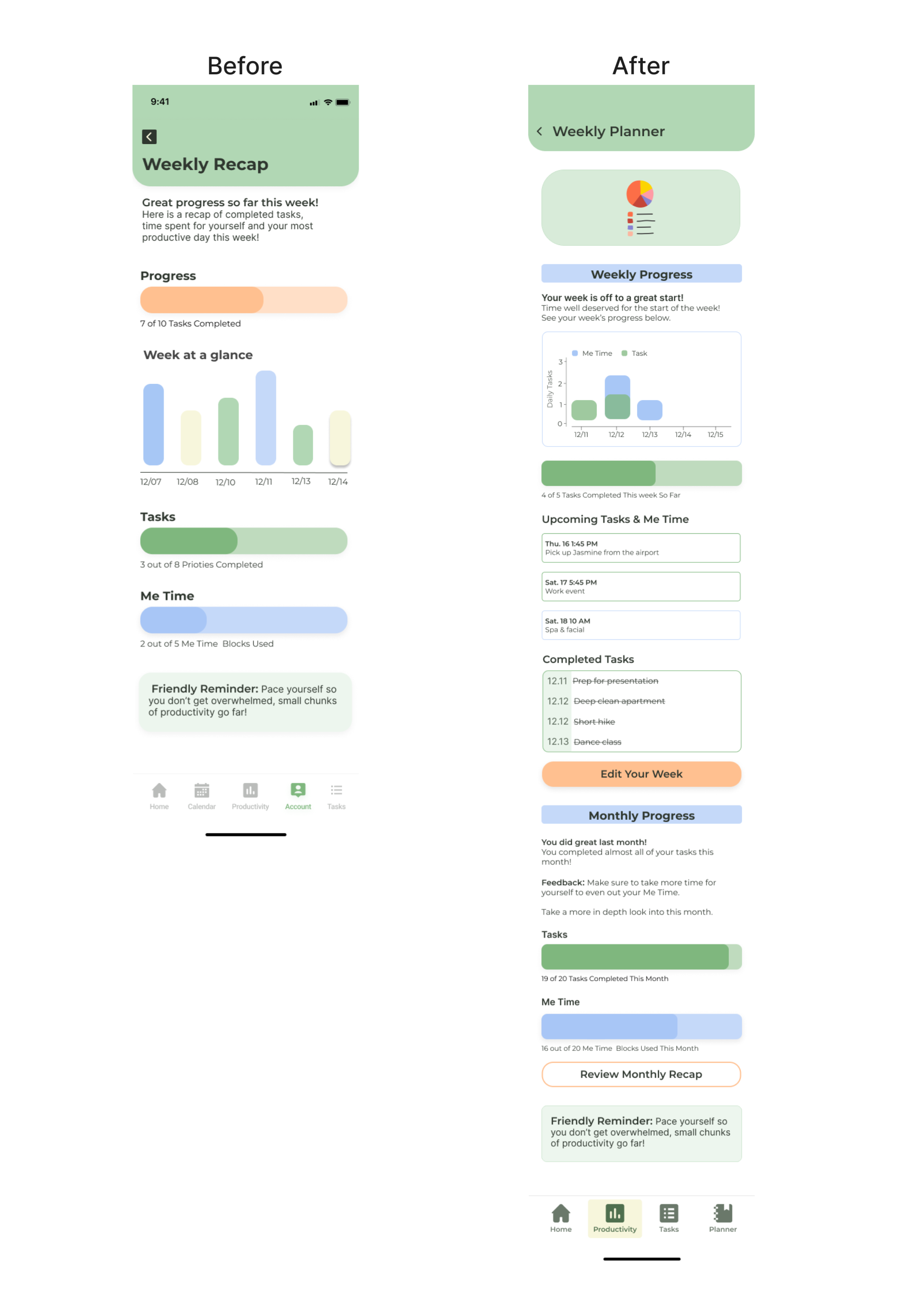
Redesign
After conducting my user testing I gathered all of my notes from each user and created an affinity map to find similar pain points. With this map, I then categorized what was a critical, major, minor, and normal issue. This helped me focus on my redesign.
I elaborated more on the colors of the graph bars and their meaning.
As well as a view of what was completed and what was upcoming


Reflection
As someone who has a variety of planners and keeps track of to-do’s, the best part of this project was getting feedback from fellow designers and the users I interviewed. Planning has many approaches so looking back at the many revisions of both UI and UX helped shape the app and my understanding as to what would work for all users.
Naturally, there is always scope for enhancement, particularly with a new application. However, Mindful will accomplish its intended function, serving not only as a tool for monitoring and scheduling but also as a prompt to pause and show yourself compassion.
UX Design Main Takeaways
Consider how the app will function
User Flows; where does the flow take the user
Creating understandable paths, "happy paths"
How to improve on feedback from users
UI Design Main Takeaways
The design should make sense to different users
Keep things minimal, the user is generally accustomed to simple designs
Defining understandable user feedback on buttons
Keeping styles consistent to avoid confusion
Challenges:
Combining a productivity app with a balanced-driven theme was challenging because promoting productivity may contradict someone's need to take a step back. I needed to incorporate details to remind the user to consider their well-being while getting as much done.
In terms of design refining components and really making things as simple as possible proved to be a challenge but an overall great thing to learn, less is more.
What I learned:
I learned to categorize the information received from interviews, user feedback, and fellow designers and practiced prioritizing what to focus on.
Framing selections and creating components to be reused became very helpful through the prototyping process.
What is visually appealing to me not be to others and simple is the way to go.