Making EHR more efficient, logical, and aesthetically pleasing.
For this client, I was tasked with transforming high volumes of patient data into an accessible view for clinicians to interact with in an electronic health record system.
The goal was to create an EHR user interface that would enable the clinician to quickly explore patient history, especially for patients with an extensive medical history and for urgent circumstances.
Problems
Hard to get a big picture:
The information in these programs consist of a hierarchy that is illogical or complicated, so it takes clinicians a longer time to analyze. There is no way to get a “snapshot,” or a quick summary of patient data to understand what is relevant.
Complicated structure:
During initial user research, doctors expressed the idea that it is easier for them to print a bunch of paper documents than to try to learn and work with the system.
Cannot accomodate different users or devices
EMRs are accessed by multiple users: physicians, caretakers, lab workers, pharmacists, etc. EMRs rarely have workflows/modules that fit each user’s agenda. This means that healthcare workers spend more time navigating the system because they can’t perform the needed actions for their work. EHR platforms also aren’t designed for a tablet device. They don’t take into account their capabilities and interaction features, and also don’t use all the available functionality of modern devices. This all slows down the doctors and their work process.
Hard to reconstruct chronology
Each patient visit adds to a patient’s history, leading to large amounts of records with different information for each patient. It is difficult to reconstruct the chronology of events leading up to a particular health event, and thus identify the relevant items.
Cluttered UI
A common source of errors in EMRs is a cluttered UI design. This tends to increase the users’ cognitive load and the time to perform a task. A crowded interface makes users prone to errors and may cause safety incidents.
Duplicate documents
Duplicate documents are a major problem when it comes to using medical UI designs. Clinicians are asked to complete the same set of information multiple times. The amount of duplicates increases when clinicians need to collaborate. This is a time consuming and cumbersome process.
Our Solution
Our solution comprised of a few different elements. The first part consisted of a timeline feature that would streamline visualization of patient history, The main idea was that, in the interface, there would be a tool to view the history of patient visits, recent analyzes, and visits to the emergency. Also, the detailed view with filters by the hour, day, month, and year, depending on the doctor’s needs, will be available.
We came up with a timeline of the history of the patient, his or her visits, operations, medication prescriptions, and other medical indicators to quickly so that doctors can quickly familiarize with the entire history of the disease or restore any time slot by the minute.
Timeline of patient visits (video prototype)
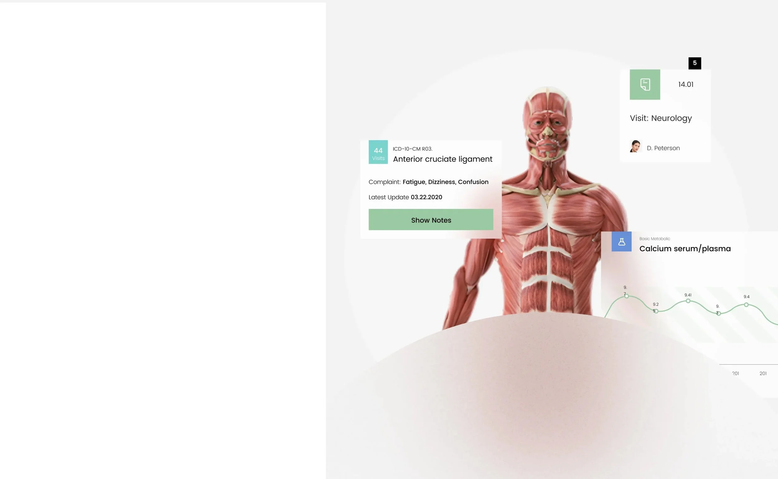
We additionally added a heatmap feature to better visualize the ailments that the patient is facing. The stakeholder has proposed implementing the visualization with the help of the human body, which will allow doctors to quickly understand the problem and it’s priority.
Heatmap feature (video prototype)
GUI to facilitate patient-doctor communication
As part of the project, we decided to create additional screens to facilitate interactions between the doctor and the patient outside the hospital. This allows the clinician to monitor his/her patients’ health, and allow the patient to feel more in control of their health. We have created an app interface where the patient will be able to communicate with their doctor regarding things like asking questions, scheduling appointments, and more.
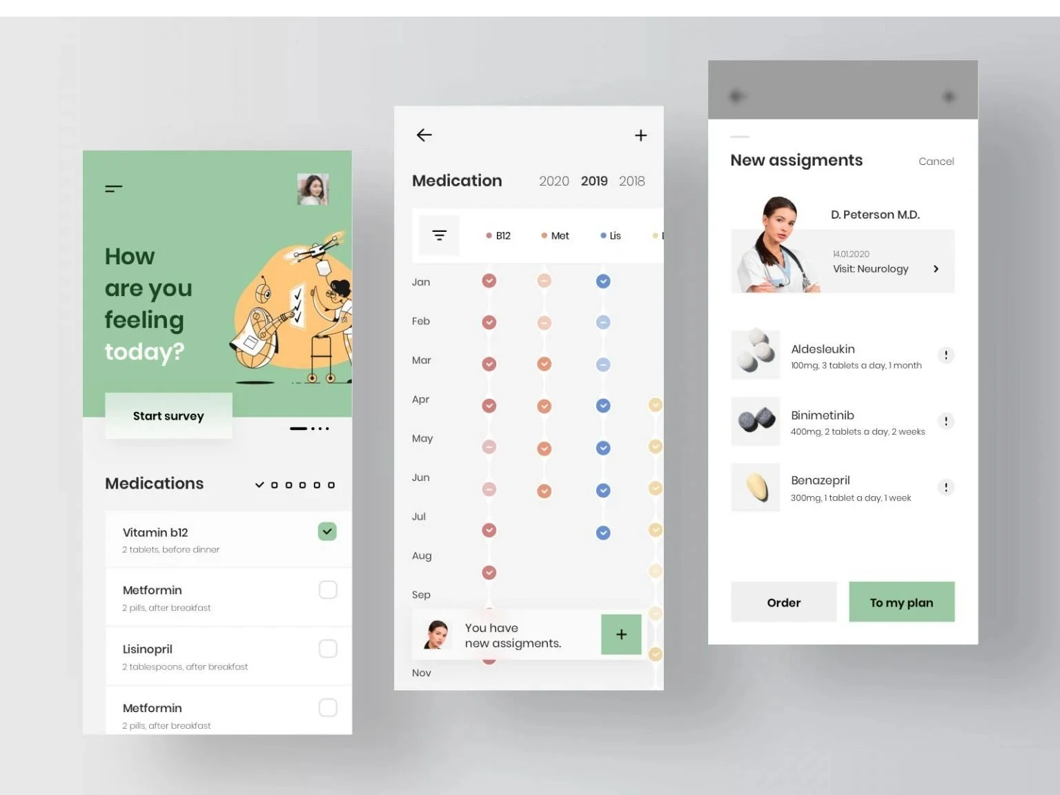
Example UI screens for the affiliated app.
Clear Architecture
A major concern we were tasked with addressing was ensuring a clear architecture for patient information. The following image shows an example of what the sidebar would look like, and how it would clearly and quickly display relevant patient information. This includes data like the type of visit, the prescribing doctor, and so on. This block allows a “snapshot” of the data.
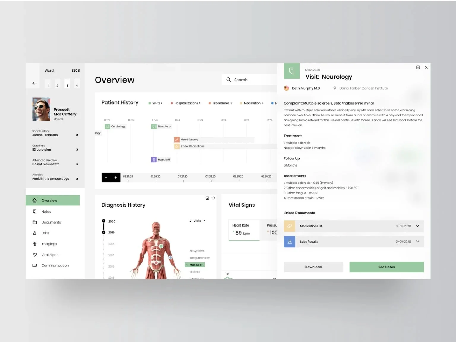
A system that allows doctors to quickly view the files they need.
Lab Tests
When working with EHR systems, it is periodically necessary to compare laboratory tests. Doctors may need to look at individual test results, compare different tests to one another during treatment, and look at important indicators during an emergency. We built out a lab analysis page to better facilitate this.
Filtering analysis of lab results by one parameter (video prototype)
Conclusions
This was an interesting and challenging project for the needs it presented to create a dense UI that was still easy to interact with and contained all the necessary information. Cluttered UI design is a huge source of error, especially in safety critical environments such as healthcare. Our solution employed various design elements such as smart interactions, chart views, creative visualization, collapsable and expandable sections, and simplified navigation to reduce the amount of user input needed and to streamline all interactions.
Ultimately, this was a valuable project that enabled me to better understand and evaluate usability for any interface that requires a dense information architecture.